How to prepare your logo for a neon sign
A logo turned into neon needs a different file than one for print. Which formats to send, what to simplify in the mark and how to prepare for a free neon quote.
A logo on a business card and a logo made of light — two different jobs
A logo designed for print lives on paper, screens and vinyl, with fills, shadows, gradients and small text that reads easily on a business card. A company logo neon works differently: the mark is drawn with a line of light — a glass tube or an LED strip — and whatever cannot be traced as a line must be translated or left out.
So „can you make our logo in neon?” almost always gets „yes”, but rarely „yes, one to one”. A neon design translates the mark from print into light: we keep what people recognise the brand by and simplify what would blur once lit.
We have made neons since 2000, entirely in-house with no subcontractors — from design to installation. Below: which file to prepare, what usually needs simplifying and what to send for a quote.
Glass or LED neon — this decides what can be reproduced
For a logo on a facade or in a street-facing window, the practical choice is glass neon. LED makes sense deeper inside a venue, at reception or on an office feature wall.
- —Glass neon: a tube hand-bent over a burner and filled with noble gas, with a deep, vivid glow. A craftsman forms every curve to the design, so glass renders flowing outlines well. It works outdoors too and lasts for years, keeping its full colour.
- —LED neon: a flexible light strip imitating traditional neon, cheaper and quicker to make, with a wide range of ready-made glow colours and a flatter light. We recommend it for interiors only — it is not suitable outdoors.
Which file to send — vector (AI, PDF, SVG, EPS), not a JPG from the internet
The best starting point for a neon design is a vector file of the logo — AI, PDF, SVG or EPS. A vector describes shape with curves rather than pixels, so it scales to any size without losing quality. That matters, because a neon is usually larger than the logo has ever been shown.
The designer, agency or printer behind the mark usually has the vector — ask for the „logo outlined”.
No vector? To start with, a photo or graphic is enough, even one from a website or social media. A low-resolution JPG or PNG cannot go straight into production, though — edges blur and details merge. The mark then has to be redrawn, and doubts about its shape are best settled before the visualisation.
Thin lines, small text, gradients — what has to be simplified
Neon is a line of constant thickness — that one rule explains most simplifications. A mark that relies on varying stroke weight, fills or shading in print becomes an outline or a single traced line in neon.
Small text — a tagline, a slogan, a web address — becomes unreadable at a typical neon size, because neighbouring lines of light merge into one glow. So do very tight letter spacing and elements sitting close together.
Gradients and shadows have no equivalent in neon: a line glows in one colour. Filled shapes usually become outlines, and where a fill is really needed it can come from the background — a light box, a backing panel or 3D letters carrying the neon.
Colours — light is not print
A brand-book colour is ink or pixels. Neon glows, so we perceive it differently: in glass neon the colour comes from the gas and the glass; in LED neon, from a range of ready-made glow colours.
We choose the glow colour closest to the brand identity, and the effect is best judged in the dark, when neon shows its character. That is why every neon is switched on and checked in the workshop before it leaves.
The background matters too: a company logo neon on a dark panel looks different from one on light render.
Already have a project in mind?
Get a free quoteLogo in neon, in 3D letters or in a light box?
Neon is not the only way to illuminate a logo. We also make 3D letters and advertising light boxes, and the choice of technology depends on what the mark is like and where it has to work. A short comparison:
| Technology | What it renders well | Where it works |
|---|---|---|
| Glass neon | Outlines, the silhouette of the mark and lettering as a line of light with a deep glow | Facade, shop window, interior — outdoors too |
| LED neon | A light line imitating neon, in ready-made colours | Interiors only, decoration and quick projects |
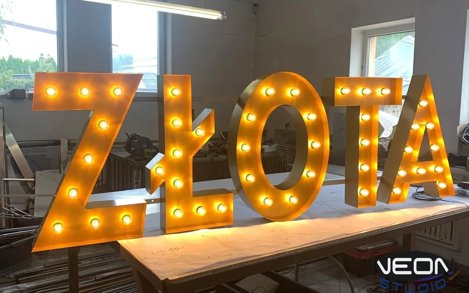
| 3D letters | Solid shapes of letters and mark, with front, halo or full illumination | Signage for buildings and venues, consistent with the brand identity |
| Light box | The whole logo, with fills, on an illuminated face of acrylic or dibond | Facade, single- or double-sided, legible by day and after dark |
Visualisation before production — why and what to check
From your logo we prepare a design and a visualisation before production starts. This is when decisions hard to undo later are made: size, line layout, glow colours and mounting — on the wall, on a panel, on a separate structure or inside 3D letters.
Check three things: whether the mark is still recognisable after simplification, whether the proportions suit the wall, window or facade, and whether the glow colours work with the background.
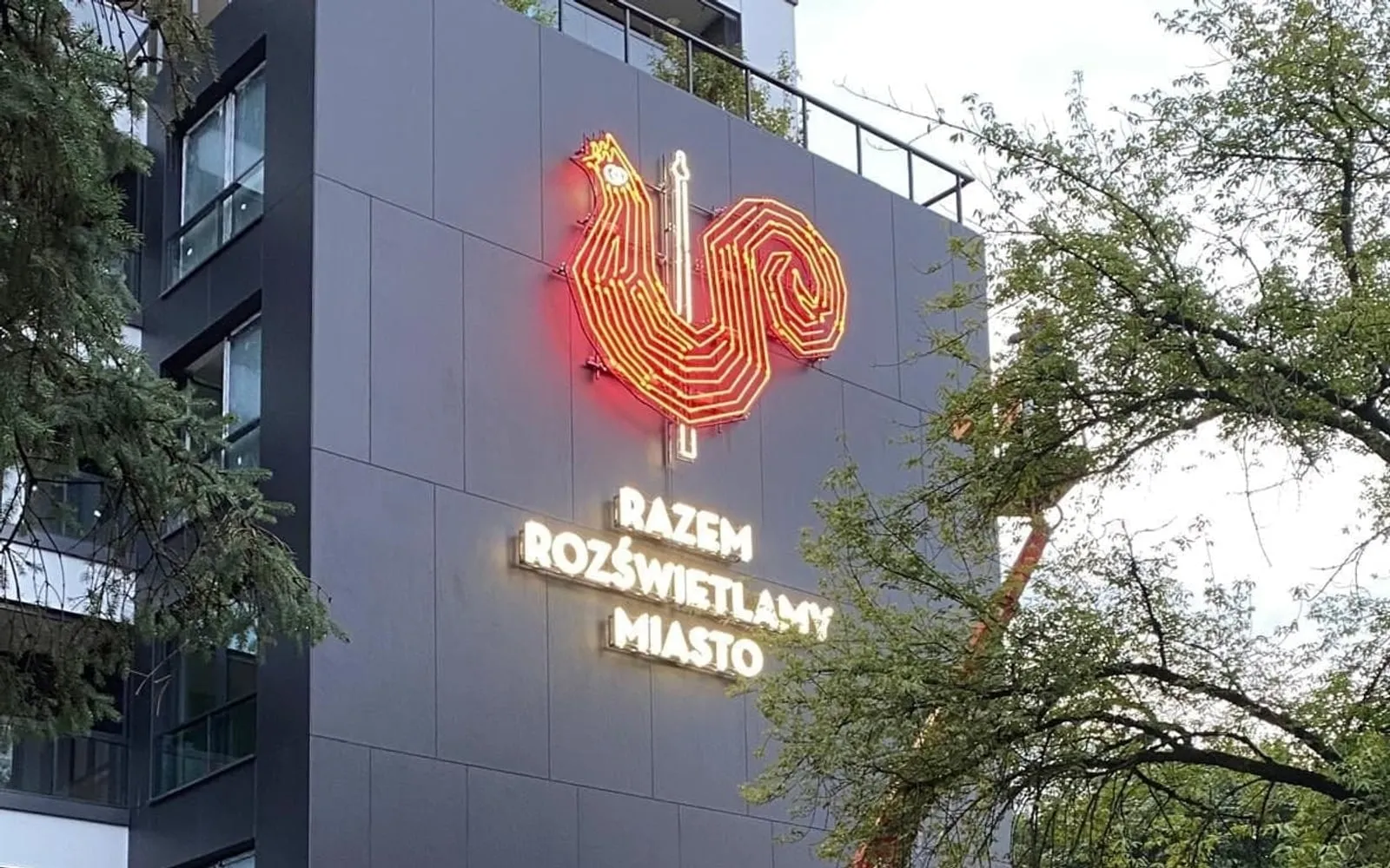
For large logos the visualisation also shows how the mark will look on the building at night. That is how we prepared, among others, the Orlen Termika logo — red glass neon on the roof of a building. Comments made at this stage cost the least: the drawing is corrected, not the glass.
Size and viewing distance
The same mark can be legible or not depending on where it is seen from. A neon logo above a bar is viewed from a few steps, one on a facade from across the street, one on a roof from a passing car. The further the viewer, the larger the mark and the fewer small elements it can hold.
That is why, when quoting, we ask where the neon will hang and from what distance it will be seen. We choose the size individually for the location and the mark — there is no single size for everyone.
Logos from our workshop — examples of our work
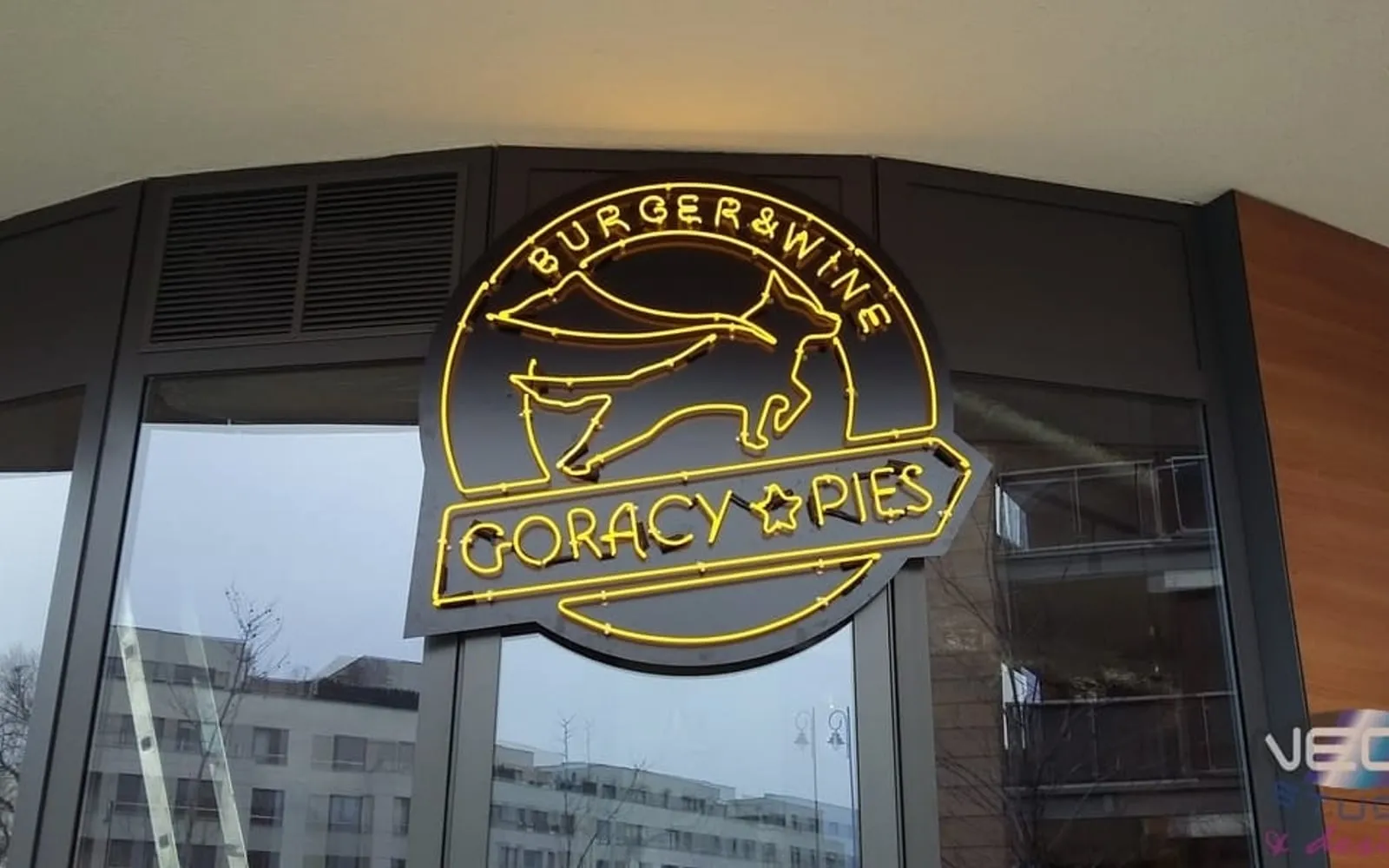
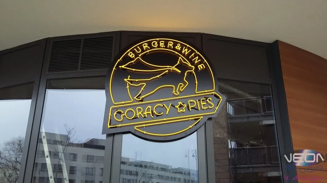
The Gorący Pies — Burger & Wine restaurant has a logo in yellow glass neon: a round mark with a dog’s silhouette, the name and a tagline. The neon traces outline and lettering, and the dark panel behind keeps the lines legible by day too.
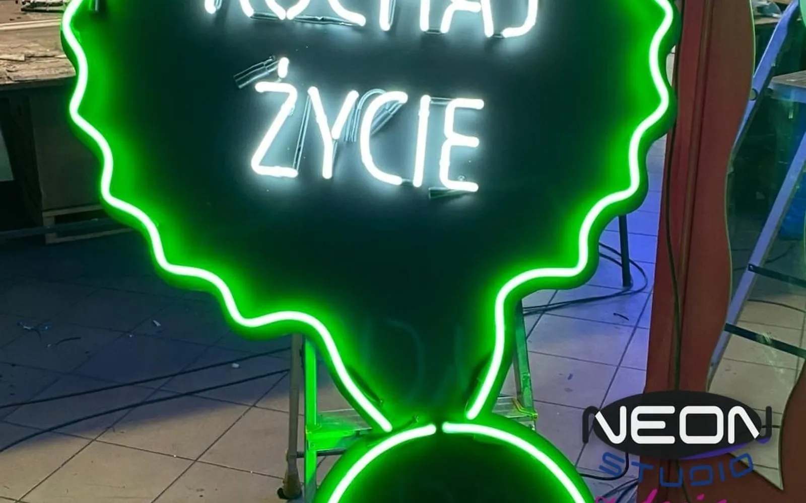
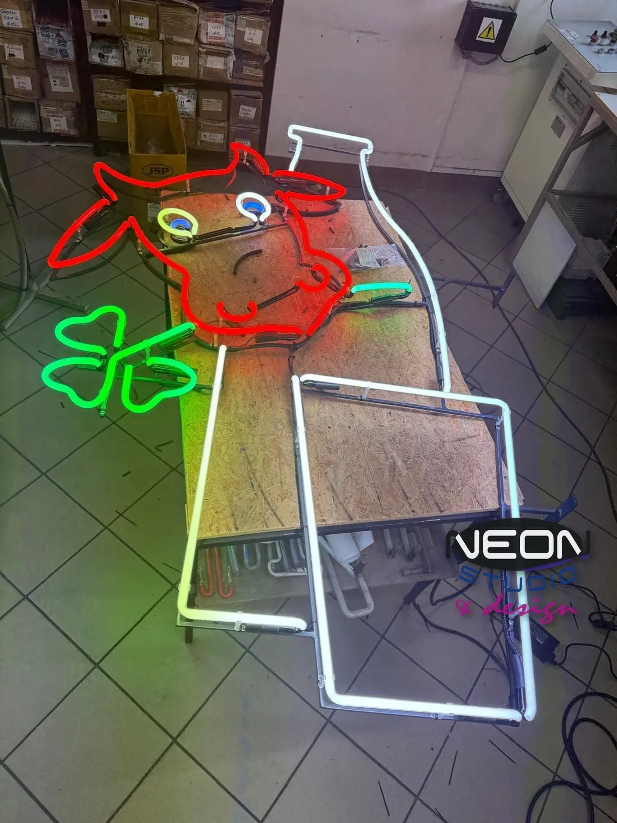
The glass neon shaped like a cow is the former logo of a milk bar, today in the Neon Museum’s collection — among the 130 neons that passed through our workshop into that collection. It is an example of a mark conceived as light from the start: several colours, clear outlines and nothing superfluous.
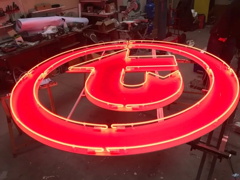
The neon T logo for ZTM, Warsaw’s public transport authority, shows a simple geometric mark in glass neon — with a double circle around the letter.
What to send with your logo to get a quote
The quote is free and carries no obligation. The more information we get upfront, the sooner we come back with a design, a visualisation and a price.
- —The logo — ideally a vector file (AI, PDF, SVG, EPS); if there is none, a photo or graphic to start with.
- —The location: facade, shop window, venue interior, reception — this decides the technology.
- —An approximate size, or the width of the wall, window or facade.
- —The distance from which the neon will be viewed.
- —The background colour it will hang on, and preferred glow colours.
- —Whether installation is needed — we do it ourselves, at height too, including the electrical connection.
Frequently asked questions
- Is a JPG of the logo enough?
- To start with, yes — a photo or graphic is enough for a first conversation and a quote. For the design, though, a vector file (AI, PDF, SVG, EPS) is best, because it scales without losing quality. If there is none, the mark has to be redrawn.
- Can any logo be made as a neon?
- Almost any, but rarely one to one. Neon is a line of light, so small text, gradients and fills have to be simplified or moved to the background. When a mark needs solid areas, 3D letters or a light box are often the better choice.
- Do you help simplify the mark?
- Yes. We prepare the neon design from your logo and suggest what to simplify so the mark stays recognisable. You see the result in the visualisation before production starts.
- Glass or LED for a company logo?
- For a facade or a street-facing window — glass neon, which works outdoors too and lasts for years. LED neon is a cheaper imitation that we recommend for interiors only, for example at reception.
- Will I get a visualisation before production?
- Yes. From your logo we prepare a design and a visualisation before production starts — it shows the size, the layout of the lines, the glow colours and the background the neon will hang on.
- Do you charge for a quote?
- No. The quote is free and carries no obligation. Just send your logo through the contact form and describe where the neon is to hang.