Bulb letters — retro signage making a comeback in venues
A row of bulbs in a letter recalls cinemas and fairgrounds and does what a flat sign cannot. Where bulb letters work best and what to pair them with.
The return of the marquee style
Letters studded with a row of bulbs are one of the oldest forms of illuminated advertising — known from cinema fronts, theatres and fairgrounds even before neon. For decades they fell out of favour, pushed out by cheaper, flat media. They returned with the fashion for interiors with character: restaurants, clubs and shops began looking for signage that does not look like a print.
Bulb letters are a retro form of advertising that pairs perfectly with glass neon. We make them in our workshop near Warsaw — as single letters, whole words and marquee-style lightboxes.
In this article we show what bulb letters look like up close, where they work best, how to pair them with glass neon and what to ask before ordering — using projects from our workshop as examples: Fuego, Złota, HOME, Hola Carino, Sunset Club and Okienko.
What bulb letters are up close
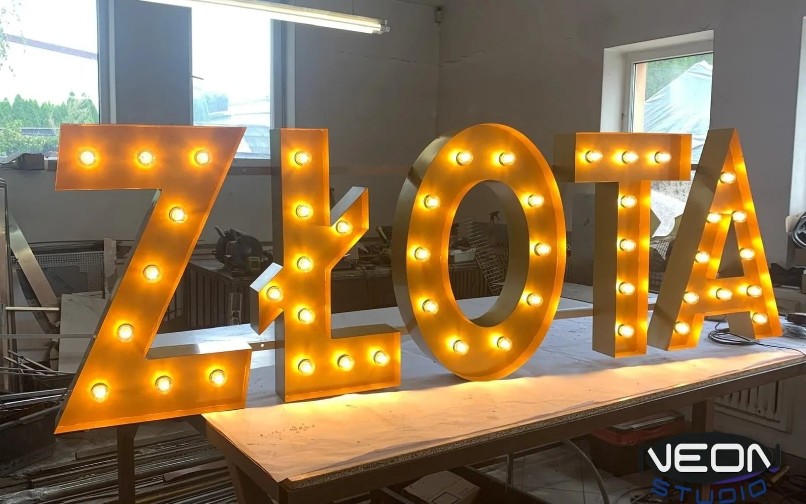
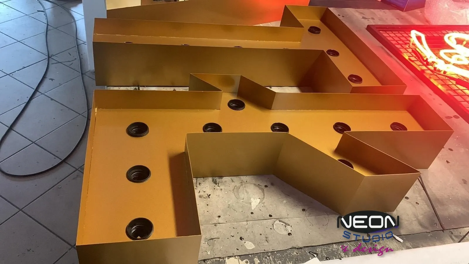
A bulb letter is a dimensional housing in the shape of the character, with a face holding a row of light points. The light does not fill the whole letter as in a lightbox, nor run along the outline as in a neon — it punctuates it. That rhythm of points gives an effect no flat print can imitate.
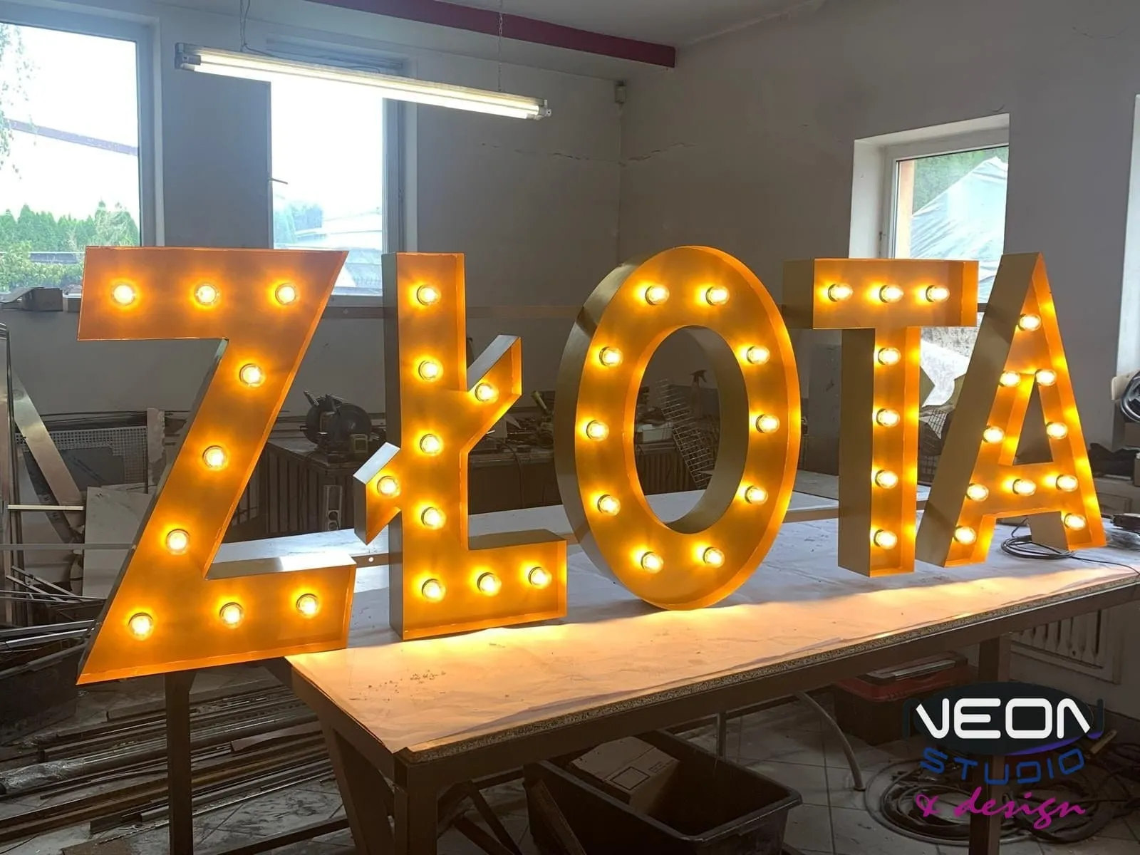
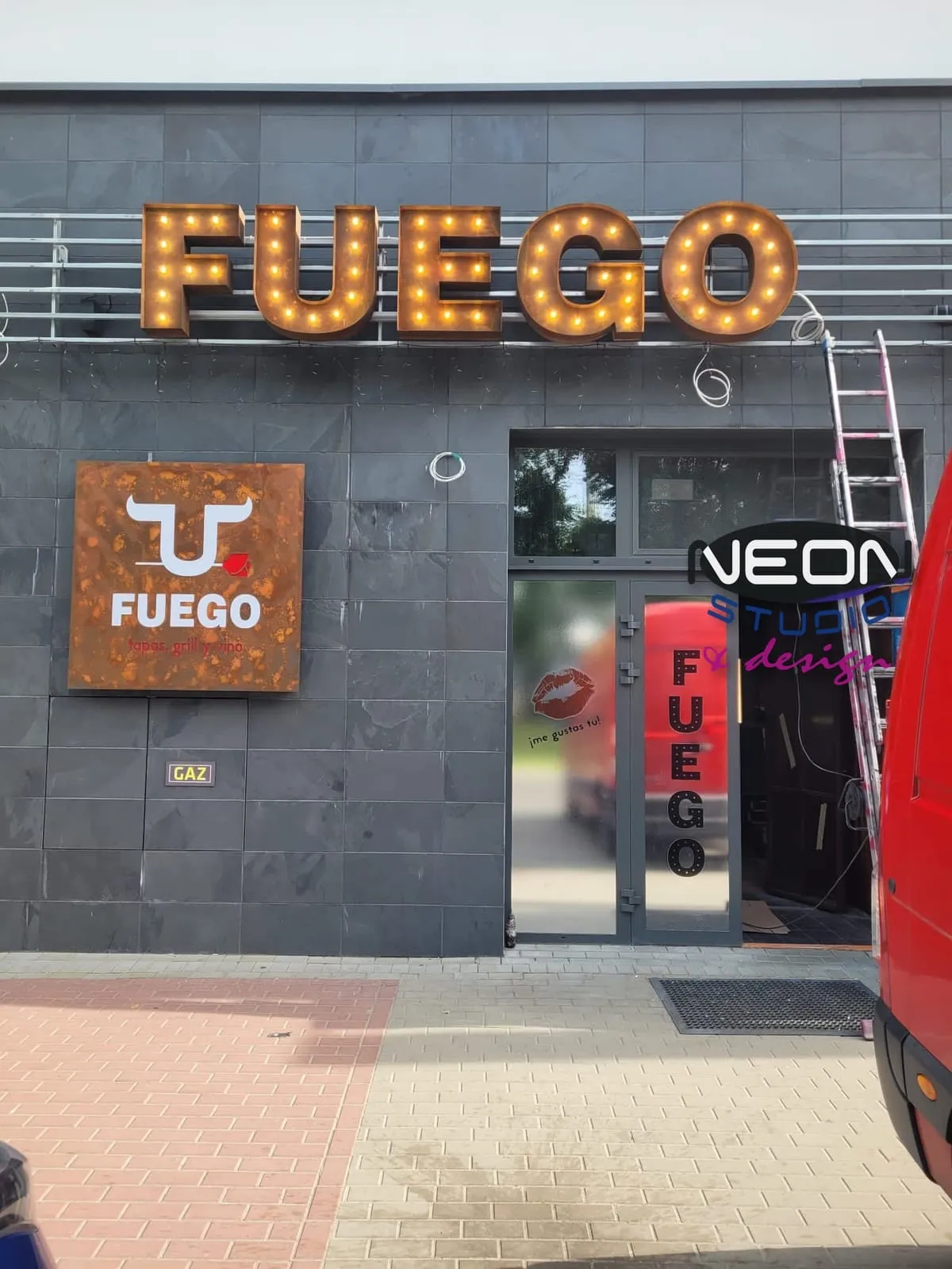
We make the housing in any typeface and colour: the white HOME letters, the gold ZŁOTA sign, rust-finished, aged letters with warm light for the Fuego restaurant. The face colour and finish decide whether the whole reads as an old Broadway sign or a modern accent in a raw interior.
Bulb letters and glass neon — a pair that complement each other
Both technologies come from the same era and in one interior they look as if they were designed together. Glass neon gives a continuous line of light and a halo; bulb letters give points and volume. The venue name in bulb letters above the bar and a tagline in glass neon beside it is an arrangement that works very well in hospitality.
There is a practical side too: the body of a bulb letter reads by day, when a neon makes little impression; after dark both work together.
Where they work best
Retro-style restaurants and bars, clubs, stages and bars are the natural habitat of bulb letters. For the Fuego restaurant we made retro bulb letters both for the interior and outdoors; for Hola Carino side-lit letters; for the Sunset beach club a sign for the facade.
Bulb letters also work as interior decoration — the HOME sign is an example of a piece that does not have to be signage.
What these places share is the guest's close contact with the sign. Bulb letters are not made to be read from fifty metres — they work where someone stands beneath them, takes a photo and remembers the name.
Outdoors — with caveats
We also make bulb letters as outdoor installations, as for the Fuego restaurant. The same rules apply as for any signage on a facade: housing and fixings in materials resistant to rain, frost and UV, and the electrical installation protected from water.
It is worth planning access to the letters, because the light sources in this type of signage are by definition replaceable and visible — the structure should allow them to be changed without taking down the whole sign.
It is also worth checking each season that all the points glow evenly — one dark bulb in a word is visible from afar.
Already have a project in mind?
Get a free quoteForms: letter, word, marquee lightbox
The simplest form is single letters mounted directly on a wall or on a rail. The next is a word in one housing — shared by all characters, with one installation. The third is a marquee-style lightbox: a rectangular or arched frame studded with bulbs around the edge, with a field for the name or graphics inside — as in the project for the Okienko venue, where a bulb lightbox hung above the window.
The form depends on the place. Above a bar single letters work better; above a street-facing window a marquee lightbox, which holds more content and is legible from further away.
How they are made in the workshop
We make bulb letters in the same workshop near Warsaw where the glass neons, 3D letters and lightboxes are made. We start with a design and visualisation from your logo or wording, then the housing in the chosen typeface, the face with the light points laid out, and finally the installation and a lighting test.
Projects are made entirely in-house, with no subcontractors. Clients who want to see the letters before collection are welcome in the workshop.
At the design stage we also settle the spacing of the light points. Too dense gives a uniform patch and loses the rhythm; too sparse makes the letter fall apart into dots. The right spacing depends on the letter height and the typeface, which is why the visualisation shows it straight away.
Bulb letters, glass neon or LED letters — a comparison
Three technologies, three different effects. The comparison helps when choosing one of them or a combination.
| Bulb letters | Glass neon | LED 3D letters | |
|---|---|---|---|
| Character of light | Points in rhythm | Continuous line, halo | Even face or halo |
| Style | Retro, cinema, fairground | Classic, prestige | Modern, universal |
| Best place | Bar, stage, retro interior | Window, facade, wall | Reception, facade |
| Outdoors | Yes, with protection | Yes, exceptionally durable | Yes, resistant materials |
| Pairs with | Glass neon | Bulb letters, 3D letters | A lightbox |
Colour, finish and patina
The retro effect is largely made by the finish of the housing. A gold face with warm light gives the impression of an old sign; white letters with cooler light look contemporary; black with warm light points suits raw, industrial interiors. Aged finishes are also possible — deliberately uneven, as if the letter had hung for decades.
When choosing, it is worth seeing the finish in person. In photographs the differences between gold and brass, or between warm and neutral light, are far less visible than in the venue.
The colour of the light matters as much as the face: warm underlines the retro effect, neutral suits contemporary interiors.
When asking for a quote, say straight away what mood the venue should have — American retro, industrial or elegant. That narrows the choice of finish faster than the name of a colour.
What to prepare for a quote
The quote is free and carries no obligation. From your logo or wording we prepare a design and a visualisation before production starts.
- —The wording or logo — a vector file ideally, a photo is enough to start.
- —A photo of the wall, bar or window where the letters will hang.
- —The width of the spot and the mounting height.
- —Interior or outdoors — this decides the housing and the protection.
- —Preferred face colour: gold, white, black, aged.
- —Whether a glass neon should go beside it — then we design both elements together.
Frequently asked questions
- Are bulb letters suitable for outdoors?
- Yes, we make them as outdoor installations too — as for the Fuego restaurant. The housing and fixings must then be in materials resistant to rain, frost and UV, and the installation protected from water.
- Can bulb letters be combined with glass neon?
- Yes — both technologies come from the same era and complement each other well. A name in bulb letters and a tagline in glass neon is an arrangement that works very well in hospitality.
- What colours do you make bulb letters in?
- In any typeface and housing colour — gold, white, black, and also with an aged finish. The face colour and the light colour decide whether the letters look like an old sign or a modern accent.
- How does a marquee lightbox differ from bulb letters?
- A marquee lightbox is a frame studded with bulbs around the edge, with a field for the name or graphics inside — as in the project for the Okienko venue. Bulb letters are separate characters with light points in the face. The lightbox holds more content; the letters are visually lighter.
- Where in a venue should bulb letters hang?
- Above the bar, on the wall behind the stage or in the zone where guests take photos — where close contact with the sign matters. Above a street-facing window a marquee lightbox works better, legible from a greater distance.
- Can I see the letters before collection?
- Yes. Bulb letters are made in our workshop near Warsaw, entirely in-house. Clients are welcome in the workshop — in photographs the differences in colour and light are less visible than in person.